Four months after a redesign meant to lift online sales, Loblaws had lost 17% of them.
Loblaws had the same traffic as before and a buy flow they'd just rebuilt. Four months on, online purchases had fallen 17%. The number alone couldn't say why. So, over six weeks, across two research phases, I set out to find what the redesign had broken.
Timeline
6 weeks, 2 phases
Role
Research Framework Design, Comp. Analysis & Benchmarking,
Research Synthesis
Discipline
#UX Research
#Usability Testing
#Product Strategy

TL;DR
What's the problem?
Two things are costing Loblaws online sales: The technology underneath the site can't keep pace, and the interaction design of the buy flow obstructs the purchase rather than supporting it.
25%
couldn't finish
checkout
5-7s
to update
a cart
35+
clicks to complete
one purchase
Latency was the dominant experience. Simple actions took long enough that participants questioned whether they had even registered. Shoppers left remembering that feeling.
Who are the owners?
One is an engineering fix and needs the platform team. One is an interaction design fix and sits with design.
What's the fix?
Two tracks have been outlined with different owners and different timelines. One is an engineering fix, and one is an interaction design fix. Both are needed. What separates them is time, cost, and who owns the work.
Track 1
Invest in the platform
Takes the longest, costs the most, but it's the most important fix in this study.
1
Completion Time: Multi-Quarter
Track 2
Fix the patterns that interrupt the purchase
Cheaper, faster, and none of it waits on Track 1. Improves buy flow, but speed stays the same.
2
Completion Time: One or less quarters.
Can start now
Process
How I got these numbers
I ran a competitive analysis first,


Comparing Loblaws' desktop and mobile web app's buy flow against Food Basics (direct competitor) and Instacart (indirect).
All three were evaluated against a seven-stage framework I built beforehand that was based on Baymard's checkout usability research.
Then I tested with users second.
8 moderated usability testing sessions, 4 tasks each — produced 8 findings logs, clustered in FigJam by theme, heuristic, and severity.
Each participant was screened for digital ordering familiarity and excluded anyone working in UX, food service, or related industries.
The 4 tasks participants were instructed to complete:
Browse and Add Items
Find a Deal
Review Your Cart
Continue to Checkout
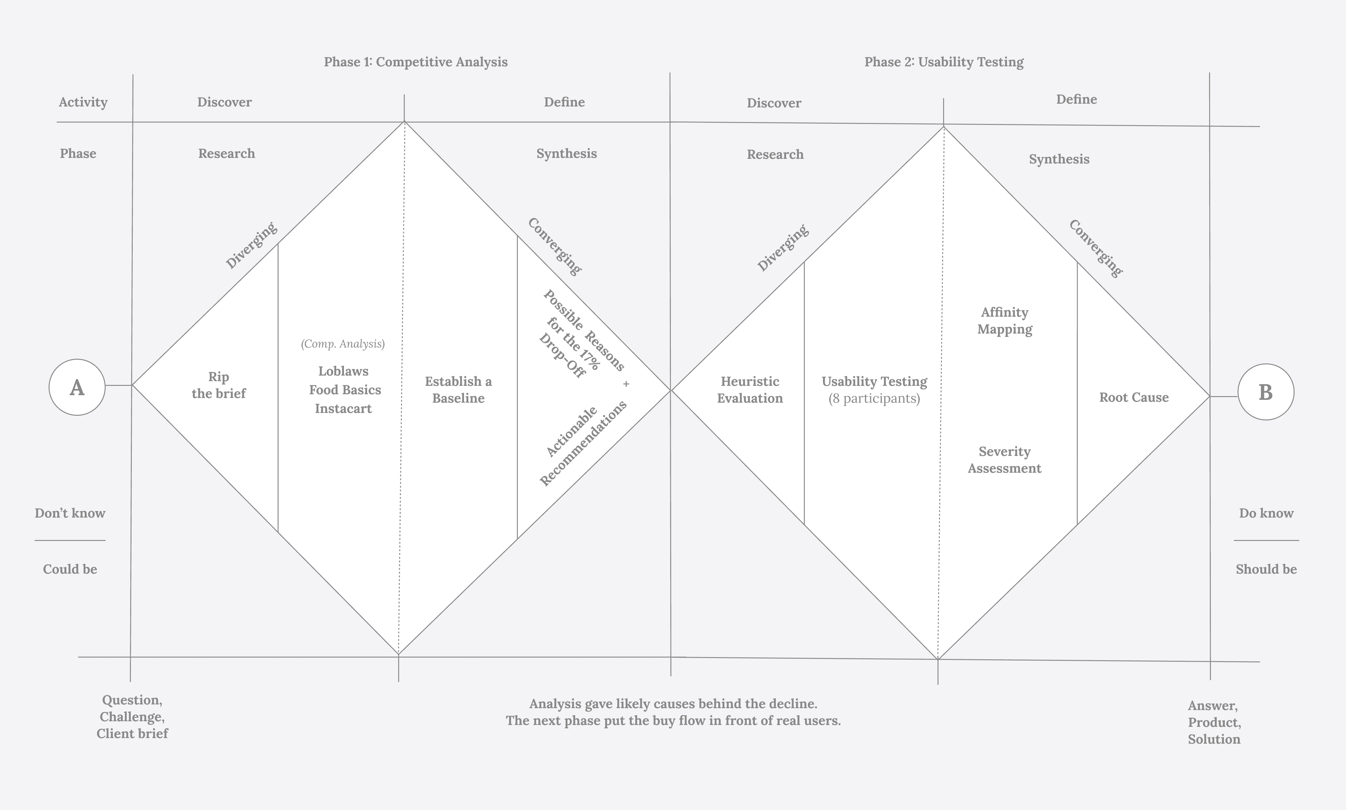
I ran the first half of the Double Diamond twice
One diamond to define the problem, one to solve it. The competitive analysis diverged across three platforms and converged on a benchmark; the usability sessions diverged across eight participants and converged on a root cause.
Findings
8 sessions produced 8 findings logs, clustered in FigJam by theme, heuristic, and severity.
After re-reading the clusters, I began to notice a set of issues that no redesign can fix — the lag, the dropped sessions, the wiped cart. That's when investing in the platform became half the answer. The themes I'd clustered eventually fell into two: Backend and Interaction Design.
Theme 1 · Backend
The backend can't keep up with the redesign.
These issues are not a matter of judgment. Rather, these are things the site fails to do regardless of how it was designed.
Interactions across the flow take seconds to respond
Loblaws' site was visibly slower than both competitors, and users felt it. Pages load on average 5-7 seconds during cart updates. Participants clicked, waited, and questioned whether it had registered at all. Complaints about slow page responsiveness appeared in 3 of the 4 tasks.
The site signed users out mid-purchase
Theme 2 · Interaction Design
Critical information arrives at the end of the flow instead of the start, or not at all.
These are about how the flow should behave. Both are failures of progressive disclosure: the site holds information it could have surfaced at any point, but releases it only when it's too late to act on. Together they break three heuristics: Visibility of System Status, Error Prevention, and helping users recover from errors.
Costs stayed hidden until the last step
Fees were described as "estimated" throughout the shopper's journey and only finalized at the payment step. Both Food Basics and Instacart disclosed theirs earlier. Participants discovered the $30 minimum only when checkout refused them.

Users are told to complete steps that are never outlined
There's no progress indicator in checkout, nor anything to say how far you've come or what's left. 2 of 8 participants couldn't finish the task: The site told them to complete the required steps without saying which ones.
"What am I missing? It says complete steps to proceed. But what steps?"
What's working well
Loblaws is not uniformly broken. Four things work well in the web app:
Recommendations
Two problems, two owners, two different costs
Track 1:
Owner:
Engineering
Timeline:
Multi-quarter
Why it matters
Track 2:
Fix the patterns that interrupt the purchase
Owner:
Product Design
Timeline:
1 or less quarters
Surface the threshold at the homepage or show progress toward the threshold as items are added.
Food Basics has a progress bar indicator. Meanwhile, Instacart doesn't.

• Improve the information hierarchy on the homepage to reduce initial user overwhelm.
• Increase whitespace between product cards + add a border around it
Implement more detailed filters (e.g., organic, ratings) and make the filter sidebar more prominent.
Ensure that search results remain relevant when filters are applied.